Real Adaptation - Brand Guidelines

Version 1.0 - February 2026

Brand
Guidelines

Visual identity system for web, funnels, and marketing. The single source of truth for how Real Adaptation looks, speaks, and shows up.
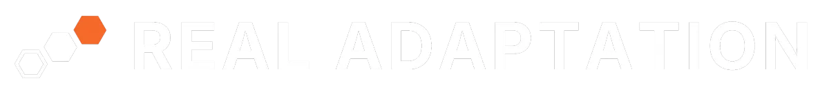
Status Locked v1.0
Typeface Inter
Primary Accent #F6692A
Audience Internal & Partners

Color Palette

A restrained, high-contrast palette. Orange is the only vibrant color - used sparingly for maximum impact.

Primary Colors
Black
#000000
Logo, headers, footers
Orange
#F6692A
Accent, CTAs, highlights
White
#FFFFFF
Text on dark, card backgrounds
Secondary Colors
Near-Black
#141414
Dark backgrounds
Off-White
#F5F5F5
Light backgrounds
Dark Gray
#2E2E2E
Body text on light
Light Gray
#E5E5E5
Borders, dividers
Orange Light
#FEF0E9
Highlights, hover backgrounds
Usage Rules
Never use pure black (#000000) for large background areas. Use Near-Black (#141414).
Never use pure white (#FFFFFF) for page backgrounds. Use Off-White (#F5F5F5).
Orange is for accents and CTAs only. Never use as a background for large sections.
Body text on dark backgrounds: White. Body text on light backgrounds: Dark Gray.
Orange Light (#FEF0E9) for subtle highlight sections, callout boxes, and hover states.

Typography

Inter is the sole typeface. All variations use Inter with different weights and sizes.

TitleBlack, 48-64px
Real Adaptation
SubtitleSemiBold, 24-32px
Setting the standard for full recovery.
HeadingExtraBold, 28-36px, All Caps
FULL FUNCTION IS THE GOAL
SubheadingSemiBold, 20-24px
Your drive is an asset, not the problem.
Section HeaderMedium, 18-20px
The Real Adaptation Method
BodyRegular, 16px
Recovery follows rules. Every input has an output. When you understand the rules of tissue adaptation, recovery becomes a math equation.
CaptionRegular, 12-14px
Labels, footnotes, metadata, and supporting text.
QuoteRegular Italic, 18-20px
"Partial strategy, partial recovery."
Typography Rules
Line height: 1.5x for body text, 1.2x for headings.
Max line width: 65-75 characters for readability.
Headings in all caps get +2-4% tracking.
Never use more than 3 font weights on a single page.
Body text minimum: 16px desktop, 15px mobile.
Heading hierarchy must be sequential (H1 > H2 > H3). Never skip levels.

Buttons & UI Elements

Consistent, restrained UI components. 6px radius, defined padding, no pill shapes.

Buttons on Dark
Input Field on Dark
Specifications
Primary Button

Background: Orange (#F6692A)
Text: White, Inter SemiBold 16px
Radius: 6px, Padding: 14px 28px
Hover: #D4551F

Secondary Button

Background: Transparent
Border: 1.5px White
Radius: 6px, Padding: 14px 28px
Hover: Fill white, text Near-Black

Input Fields

Background: #1E1E1E
Border: #333333, Radius: 6px
Placeholder: Medium Gray (#6B6B6B)
Focus border: Orange (#F6692A)

Spacing & Layout

8px base grid. All spacing values are multiples of 8.

4pxXS
8pxS
16pxM
24pxL
32pxXL
48px2XL
64px3XL
80-120px4XL
Layout Rules
Max Width

1200px desktop container. Centered with auto margins.

Side Padding

24px mobile, 48px tablet, 64px+ desktop.

Cards

8px border-radius. #1E1E1E on dark, #FFFFFF on light. 24px internal padding.

Dividers

1px solid #E5E5E5 on light. 1px solid #333333 on dark.

Visual Rhythm

Full-width sections alternate between Near-Black and Off-White.

Breakpoints

Mobile: 0-767px
Tablet: 768-1023px
Desktop: 1024-1439px
Large: 1440px+

Photography & Imagery

Dark, moody, authentic. Let the brand orange be the only vibrant color in every composition.

Photography Direction

Dark, moody tones. Authentic over polished. Real environments, real movement. Desaturated color grading. Focus on effort and focus, not posed smiles.

Image Treatment

10-30% opacity Near-Black overlay on hero images. 8px border radius on all images. Never stretch or distort. Always maintain aspect ratio.

Icons & Graphics

Outline-style icons, 1.5-2px stroke weight. White on dark, Dark Gray on light. Orange accents sparingly. Recommended: Phosphor or Lucide icon sets.

Icon Sizing

24px default. 20px compact. 32px feature highlights. Consistent across all touchpoints.

Do's and Don'ts

Hard rules. No exceptions. Every piece of creative should pass these checks.

✓ Do
Use logo files from the approved Logo Package only.
Maintain clear space around the logo at all times.
Use brand colors from the defined palette. No custom colors.
Keep text hierarchy consistent (Title > Heading > Subheading > Body).
Use Near-Black (#141414) for dark backgrounds, not pure black.
Use Off-White (#F5F5F5) for light backgrounds, not pure white.
Keep buttons consistent: 6px radius, defined padding.
Test all designs on mobile before shipping.
✗ Don't
Change logo colors, rotate, stretch, or add effects.
Place the logo on busy or cluttered backgrounds.
Use pure black (#000000) for large background areas.
Use orange as a full-section background color.
Use more than 3 font weights on a single page.
Use rounded pill buttons. Keep corners subtle (6px).
Use fonts other than Inter for any brand materials.
Use gradients on the logo or brand elements.

Source of Truth

Where to find the originals. When in doubt, pull from these locations.

Logo Source Files
Canva > Real Adaptation > 00. Logos
Brand Kit
Canva Brand Kit (colors, fonts, logos)
Exported Logos
Google Drive > Real Adaptation Logo Files
This Document
Brand Guidelines v1.0 - February 2026

Copyright 2026. Real Adaptation. All Rights Reserved.